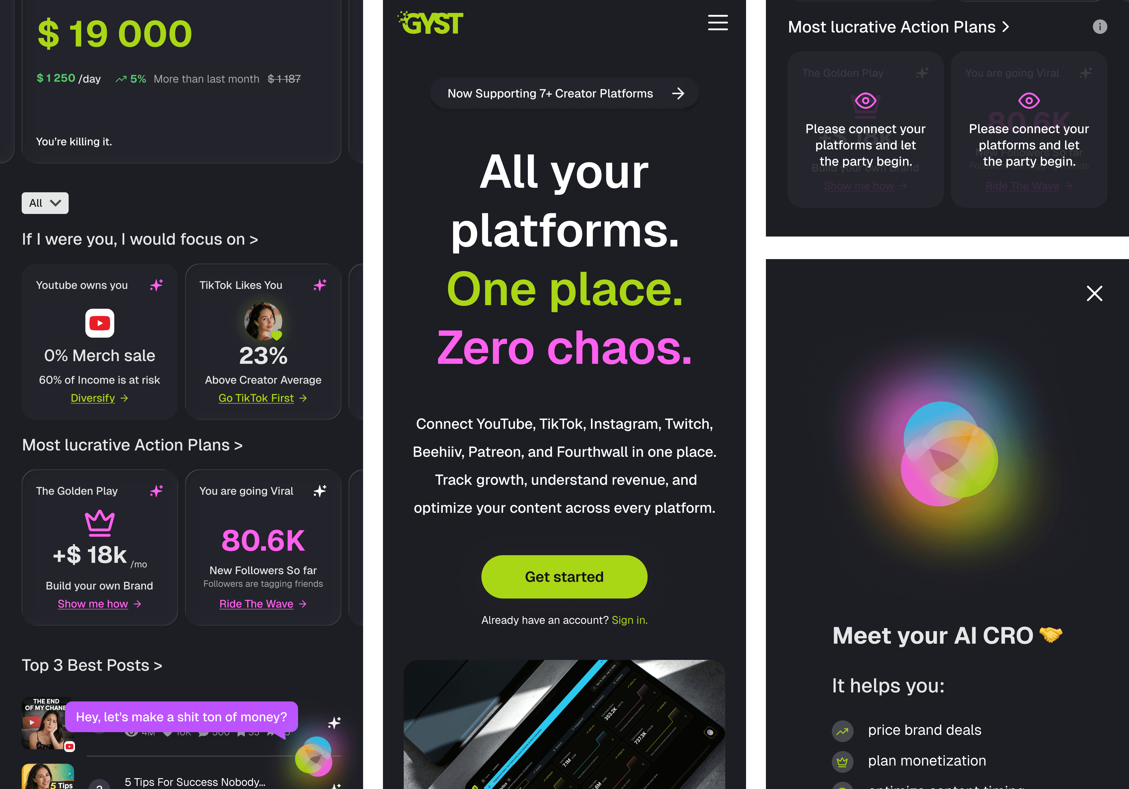
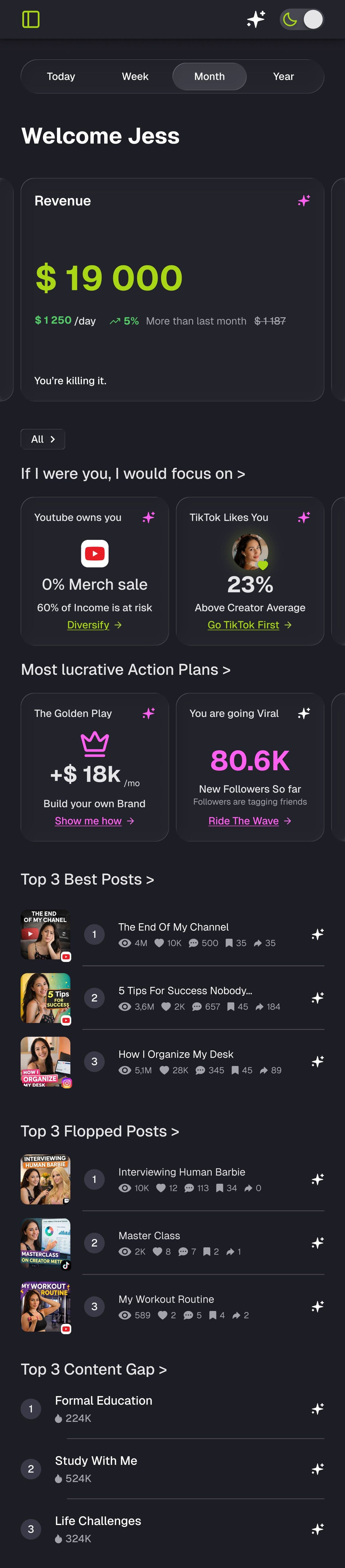
Simplifying a Data-Heavy Dashboard
GYST gathers creator data across platforms and turns it into AI-driven guidance. I redesigned the dashboard to make complex analytics clear, focused, and actionable.
Overview
"GYST - Get Your Shit Together"
Role
UX/UI Designer
Focus
Information simplification, AI interaction design, content strategy
Scope
Dashboard redesign and AI assistant experience
Timeline
2-week design sprint · 6-week UX course project
Collaboration
Team UX project including journeys, storyboards, and user flows. The group focused on onboarding, while this case highlights my dashboard work.
UX Outcome
If we do a great job, creators can clearly identify what is driving revenue and what deserves their attention.
If users need to learn analytics, the design has failed.
Pain Points
The Trust Gap | Visibility of System Status
Users don’t understand how GYST uses their data or how insights are generated, reducing trust in the platform.
Visibility of System Status
Cognitive Overload
High data complexity and a generic dashboard make it difficult for users to identify priorities.
Match Between System and the Real World & Flexibility and Efficiency of Use
Decision Paralysis
Showing all metrics at once makes it hard for creators to decide what action to take next.
Recognition Rather Than Recall